Project (5)
~ Sleep.EZ
Objective
Sleep.EZ is the newest, revolutionary sleep app on the market. Offering users in-depth statistics about their sleep cycle and sleep habits, Sleep.EZ is proving hugely popular with the Millennial generation and up to ages 45+. Their users are predominantly women, although it's a 70%-30% split. The app is used primarily in North America and Britain.Problem
The client is looking to broaden their reach further and grow the app across the whole of Europe, North Africa and Asia. To do this, they feel they need a much simpler user interface which can be easily understood regardless of your native language.Solutions
There is a lot of competition in this space, and many major devices already offer their own version of the sleep cycle app. My design decisions allowed Sleep.EZ to stand out with its unique localization features. Users are able to change their language, region and time zone within the app. These functions are especially useful for frequent travelers and users who speak multiple languages. I also wanted to ensure that the design could be apprehensive without text. Each main interface contains pictorial elements which alludes to its corresponding function.
Empathy Map
There are four major components for ascertaining the typical user for Sleep.EZ: thinking, feeling, doing and saying. I also included information on the user’s operating system. This information helped me to define key pain points and main goals.
Customer Journey
Here, we follow Lisa through the customer journey. She begins at the awareness phase, and ends at the usage phase. Along the journey, Lisa encounters problems and searches for solutions.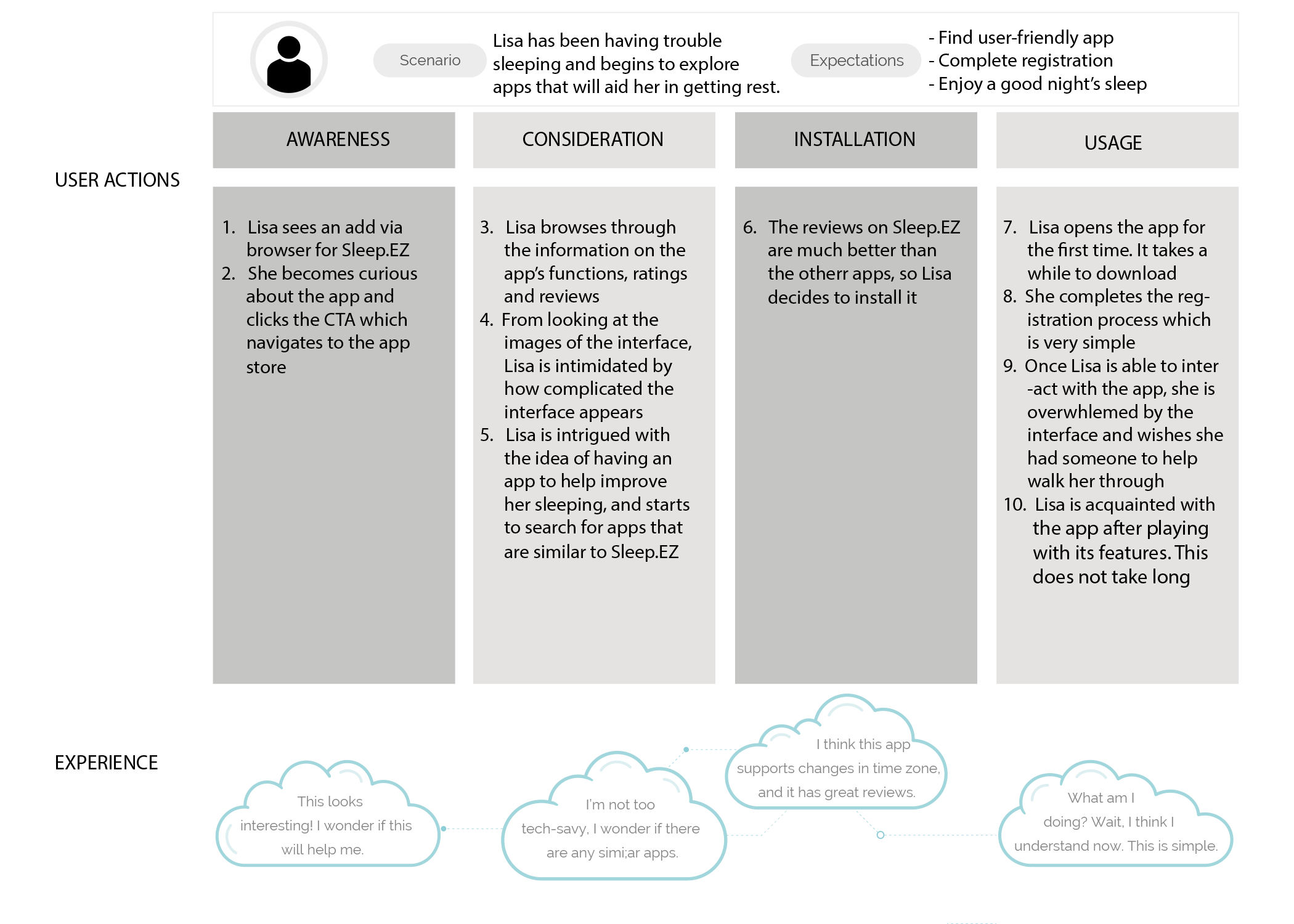
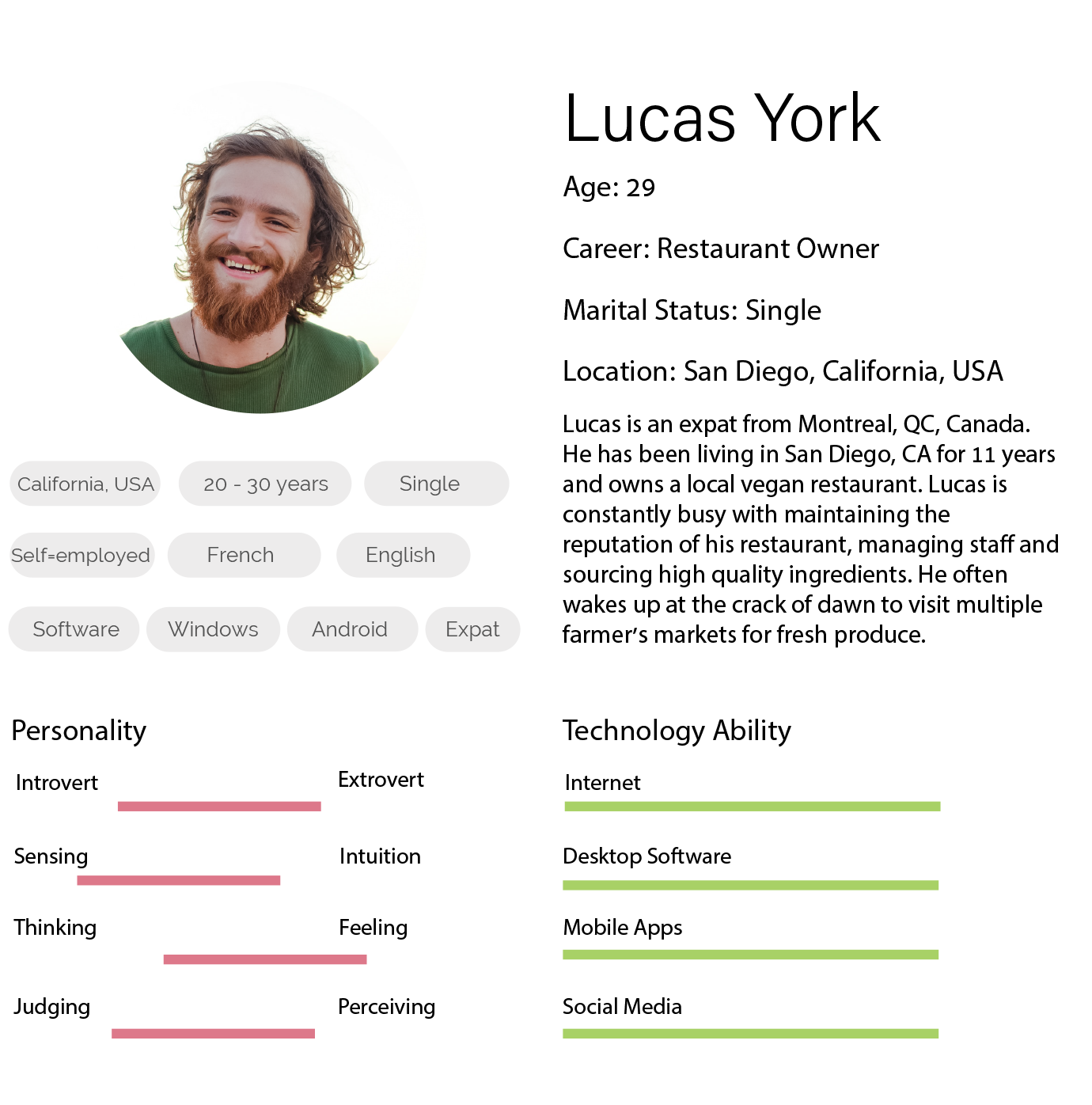
Personas
From the insights gathered from my research, we realized that there are two target personas for the solution: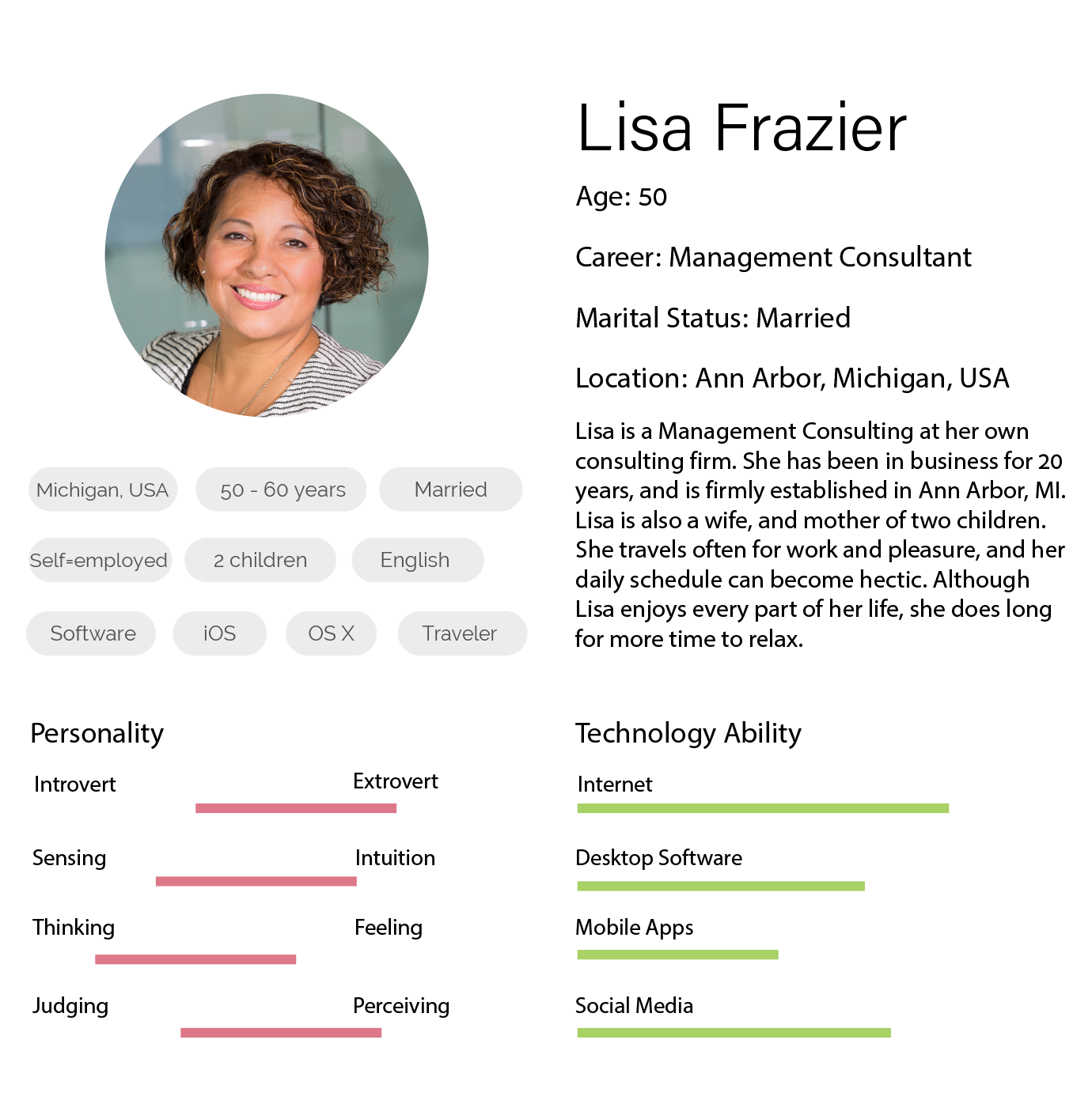
User Flow
The interactions are very straightforward. It was important to keep in mind the wide variety of users.Wireframes
The app needed to include (at minimum) a simple login process, localization features and a monitoring screen. At this stage, I also thought about additional features that would help Sleep.EZ stand out. Users are allowed to adjust the brightness, select soothing music and create a custom report.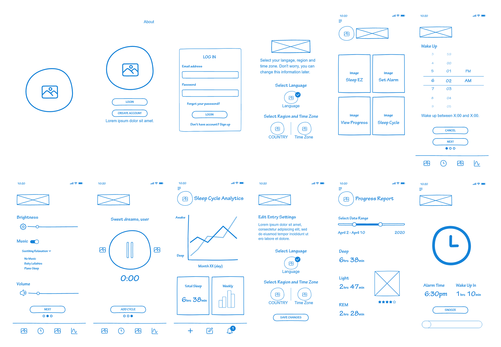
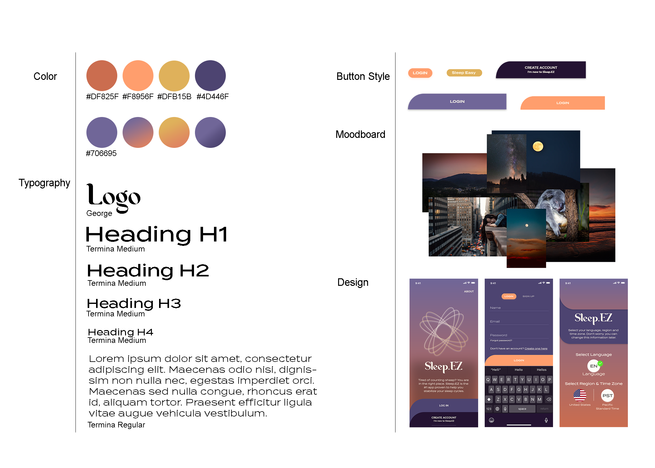
UI Style Guide
I created a moodboard in order to identify the overall look and feel of the app. The design and its colors are influenced by dusk and celestial elements.